LUCKY HOUSE
WILLIAMSTOWN
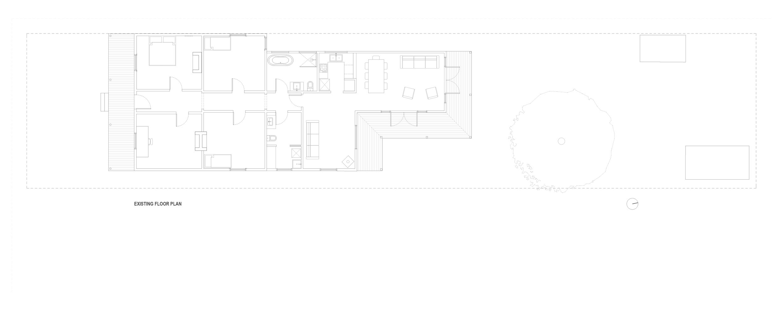
This project included the restoration of a Victorian heritage home and the addition of a new living wing that drew upon the clients love of mid century design. Connecting and blurring the boundaries between old and new, and inside and outside was essential in creating a perfect backdrop for this modern family.
Completed 2018
Photography: Tatjana Plitt
Built by: PKD Building
Featured in:
“There is not one space we do not use and love in this house.
I thank my Lucky stars every day.”
THE CLIENTS
Mick and Felicity, their two teenage children Stella & Louisa, and dog Lucky live in Lucky House. Located in the bay side suburb of Williamstown, Lucky House was purchased several years ago as the family’s “forever house”. With the double fronted Victorian growing tired, and the girls growing up, the house needed to be upgraded and expanded to accommodate the changing needs of the family and to better reflect their lifestyle.
The renovation is very much a testament to the passion and perseverance of Felicity & Mick. With a love of design, they had some very clear ideas about their dream home. From the outset they knew that they wanted to not only be involved in the design process, but to enjoy it. It is a phase that often takes even longer than the build itself! It took two attempts (a change of architect and a change of scope) and as many years, before the third and final design came to fruition. So three times lucky – Lucky House! Oh….and there is also Lucky the dog.
THE BRIEF
The front heritage section of the house had become tired and required extensive renovations. The client was determined that the house would meet modern energy efficiency standards while still maintaining the original Victorian features and character. The rear living area of the house was a 1990’s addition that lacked spatial connections, had poor thermal qualities, little natural light and minimal connection to the much loved garden. The living areas lacked atmosphere and did not reflect the family’s individual style.
The brief for this project was to bring in more natural light, make the communal spaces more liveable and connected, create a strong relationship between the house and garden, provide an environmentally responsive home, maintain the heritage features of the original house and to draw on Mick and Felicity’s love of mid century design for the new expansive living areas.
THE DESIGN INTENT
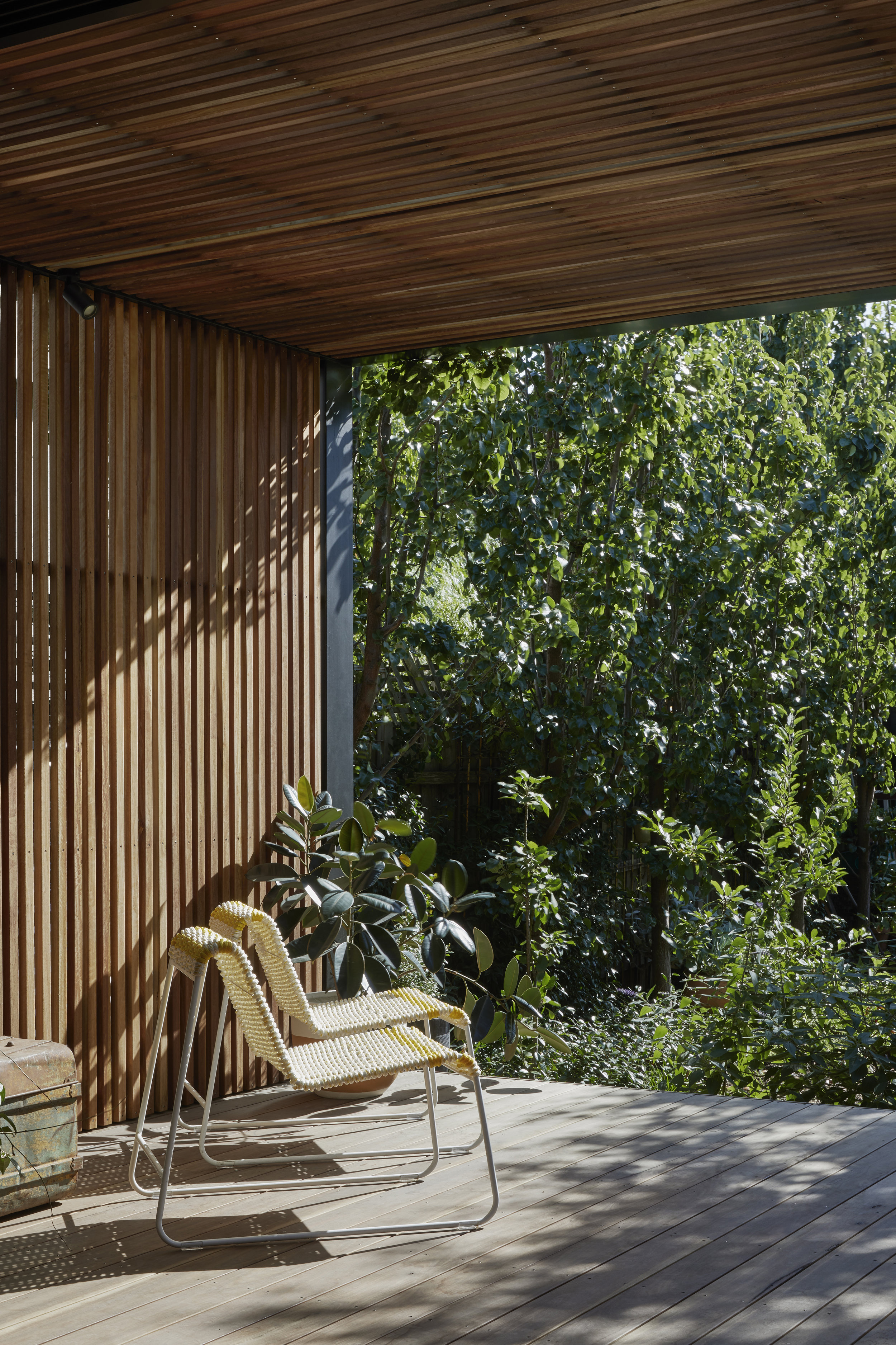
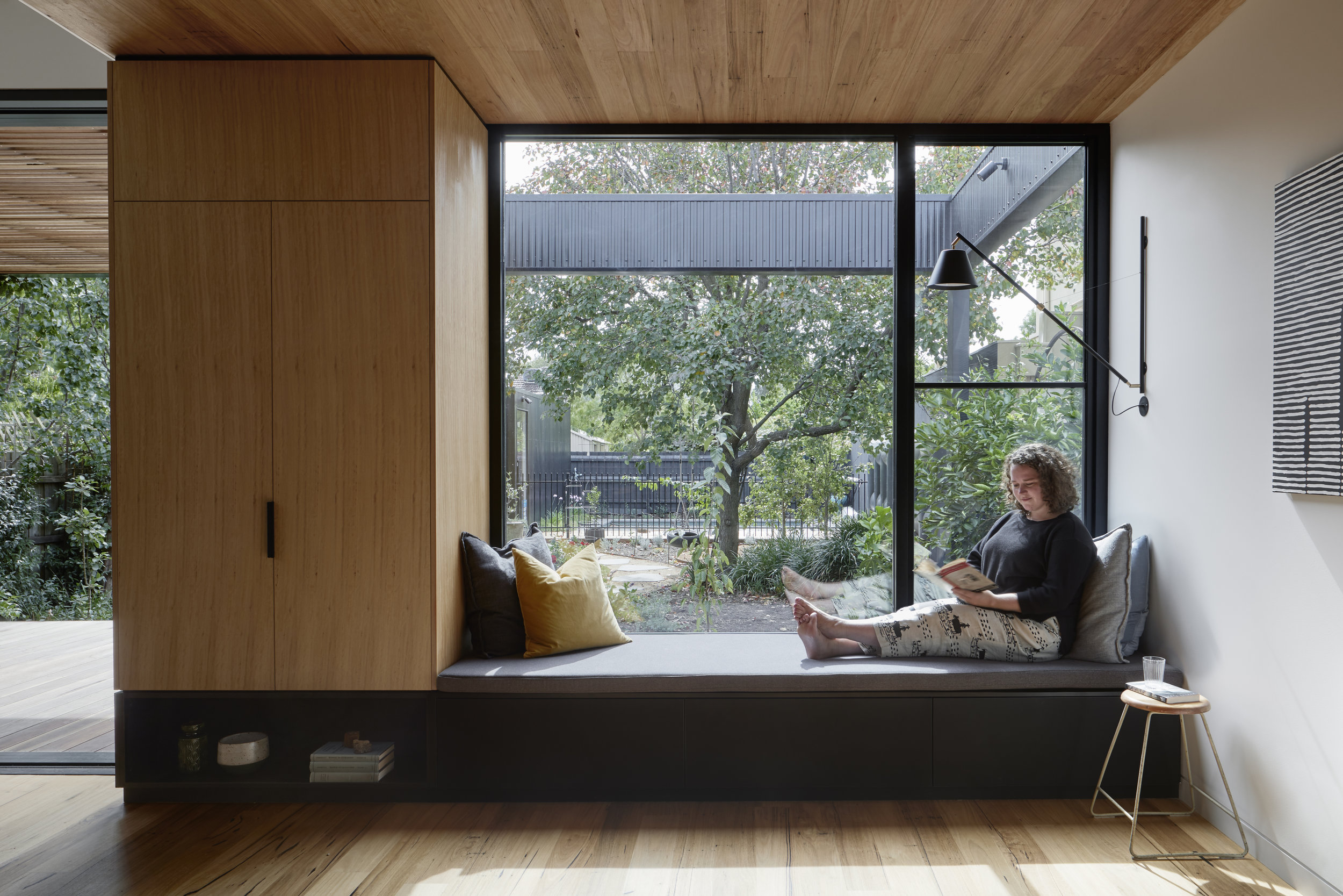
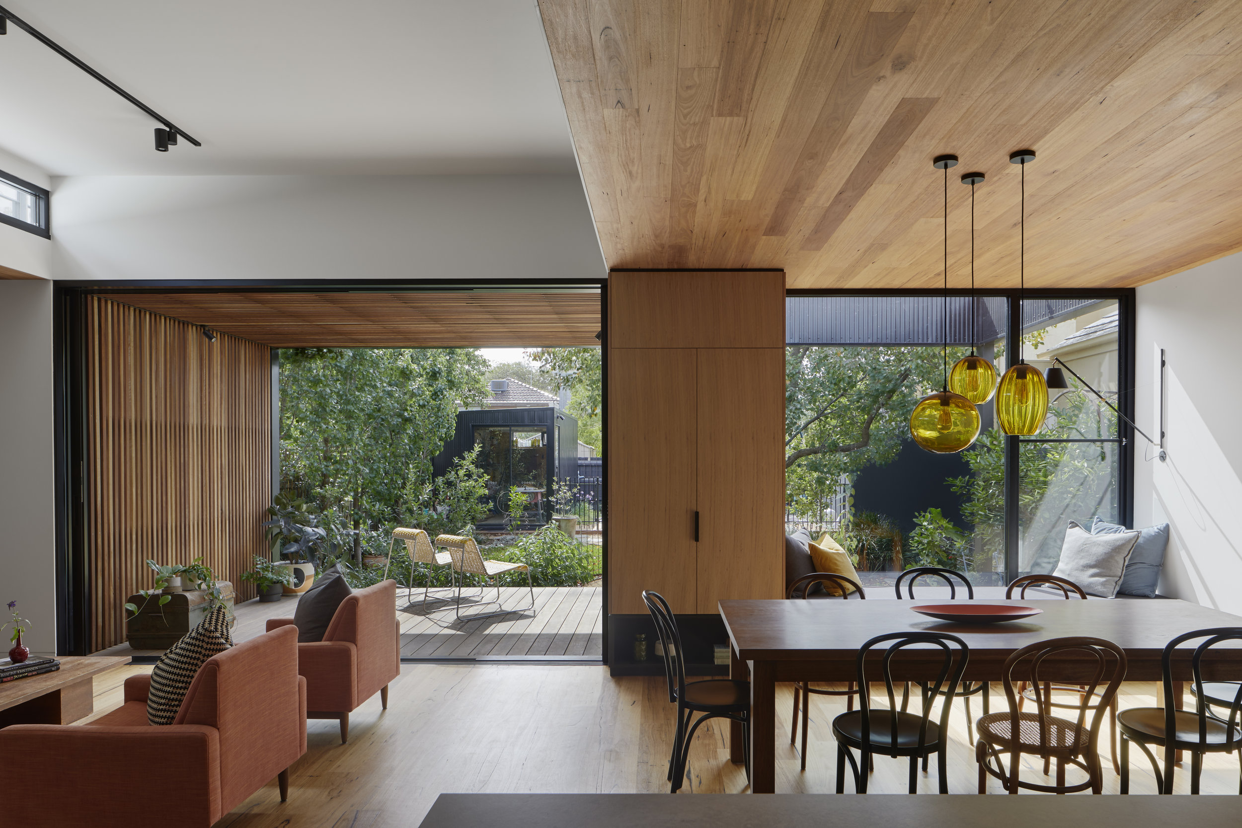
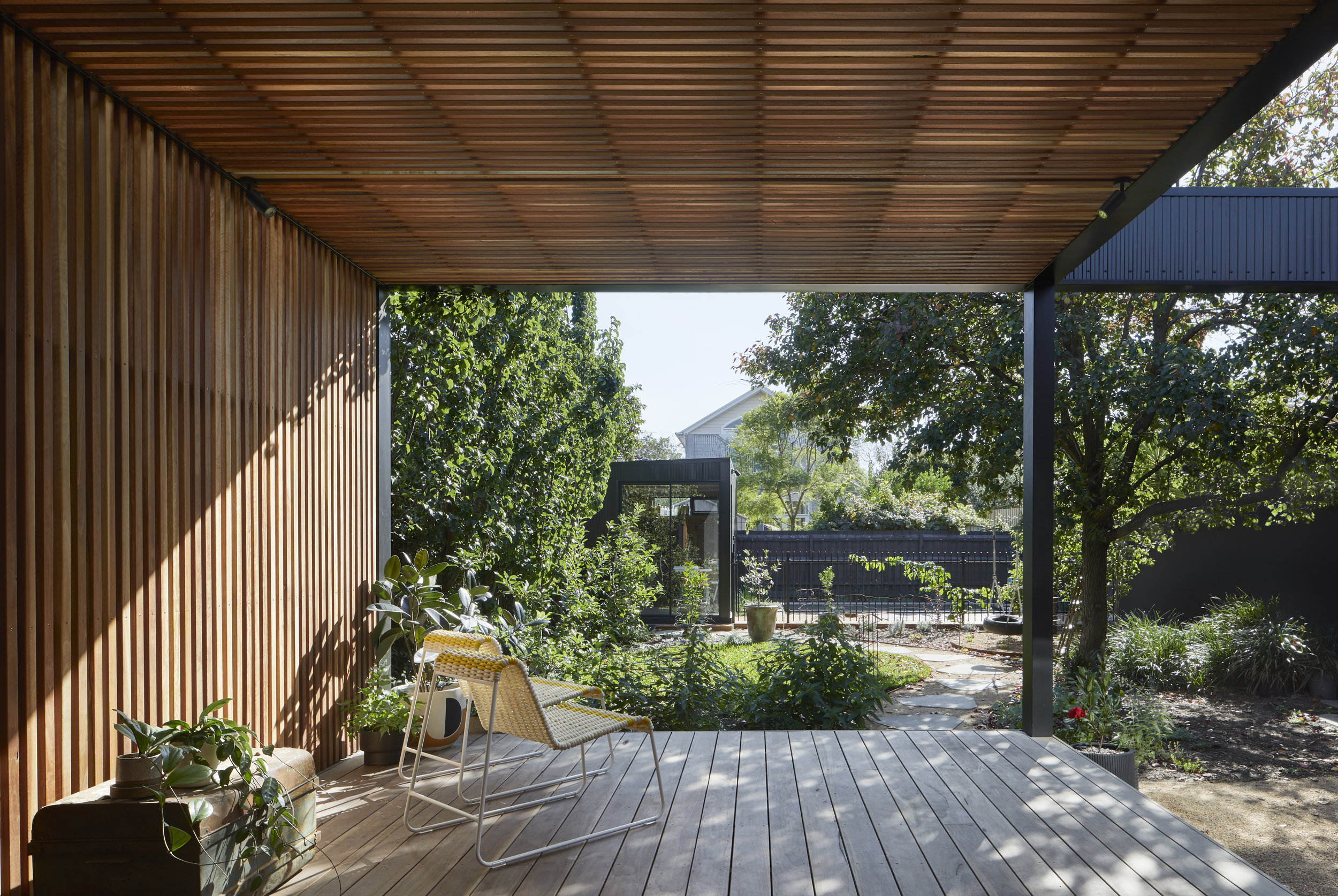
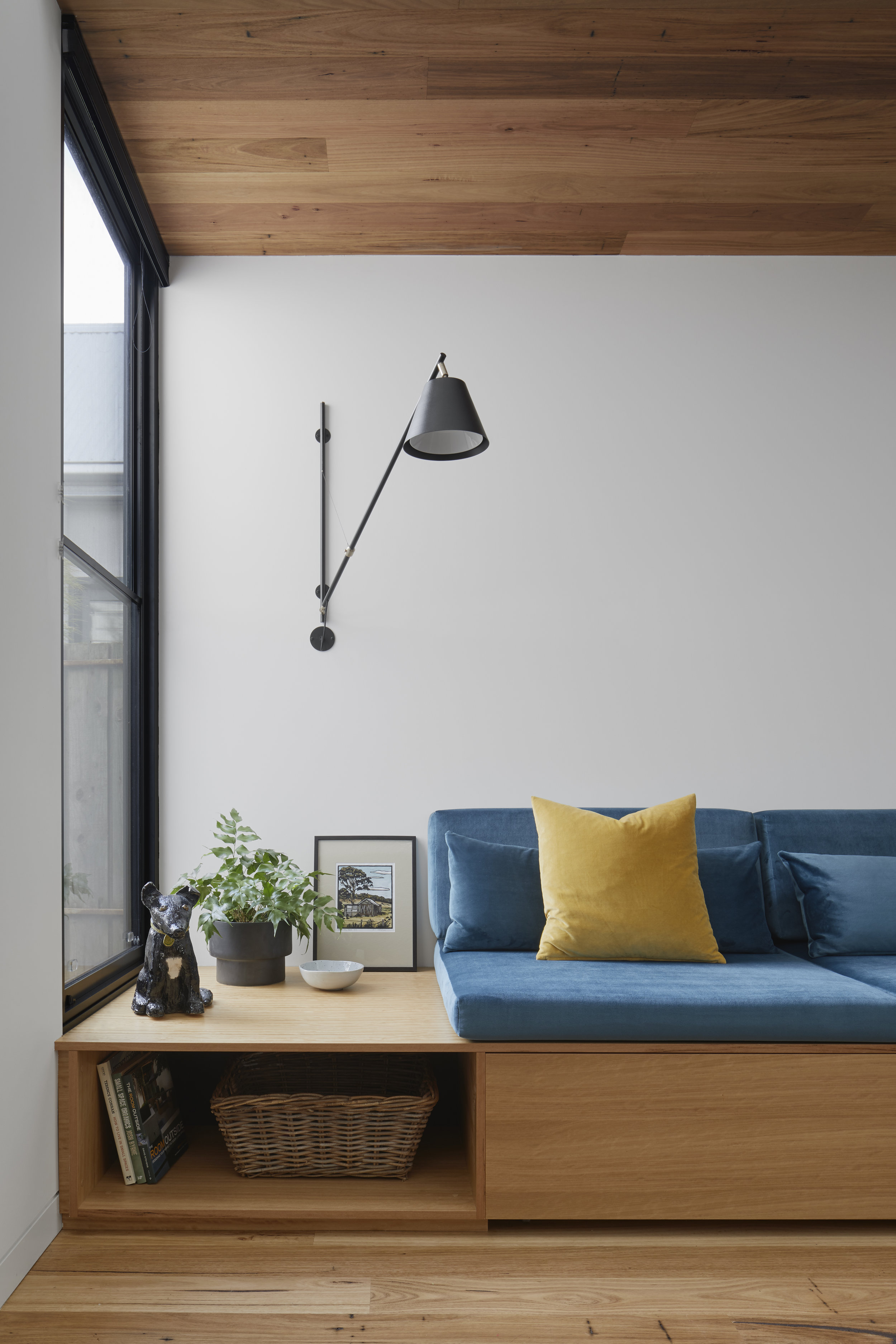
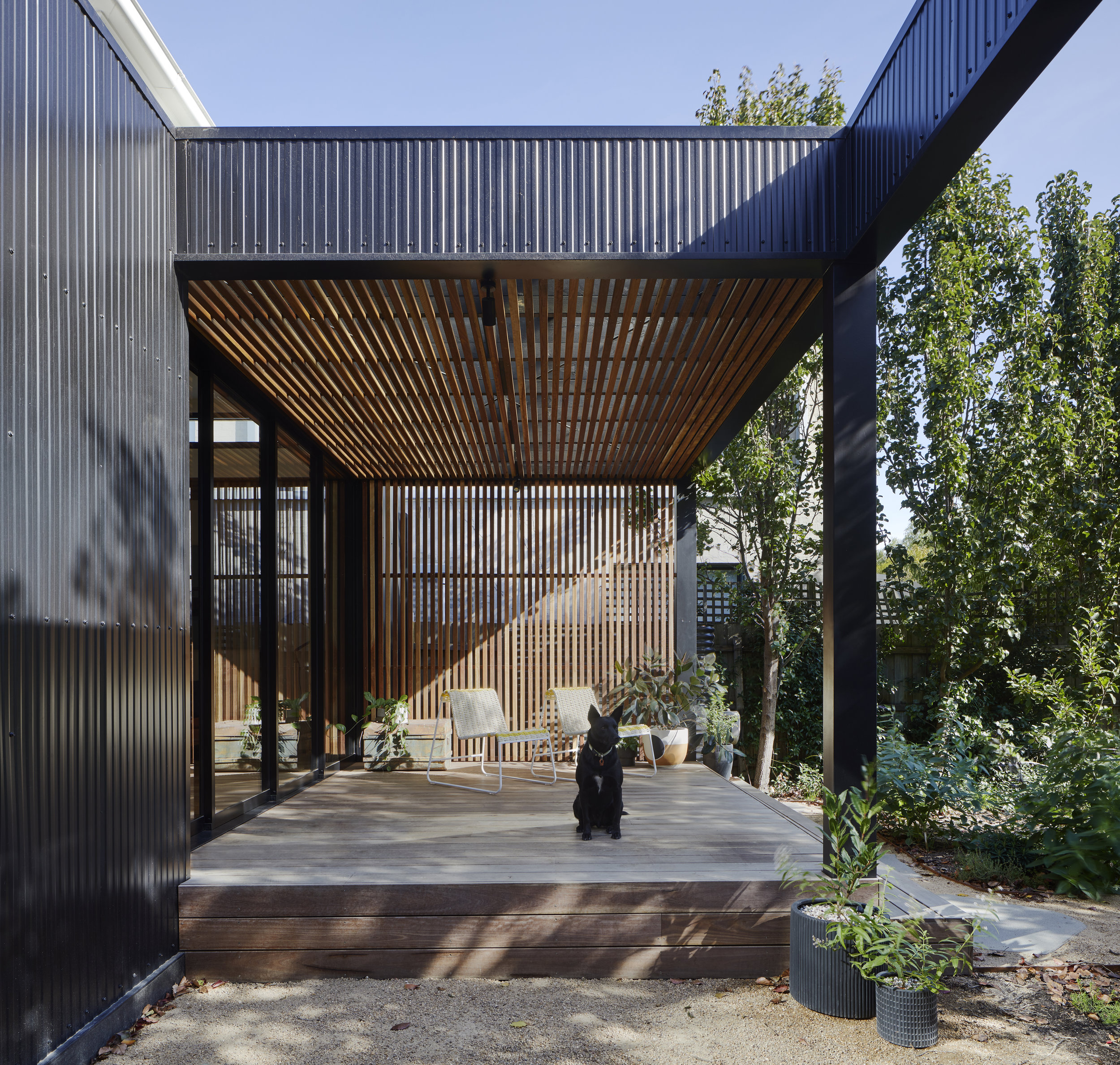
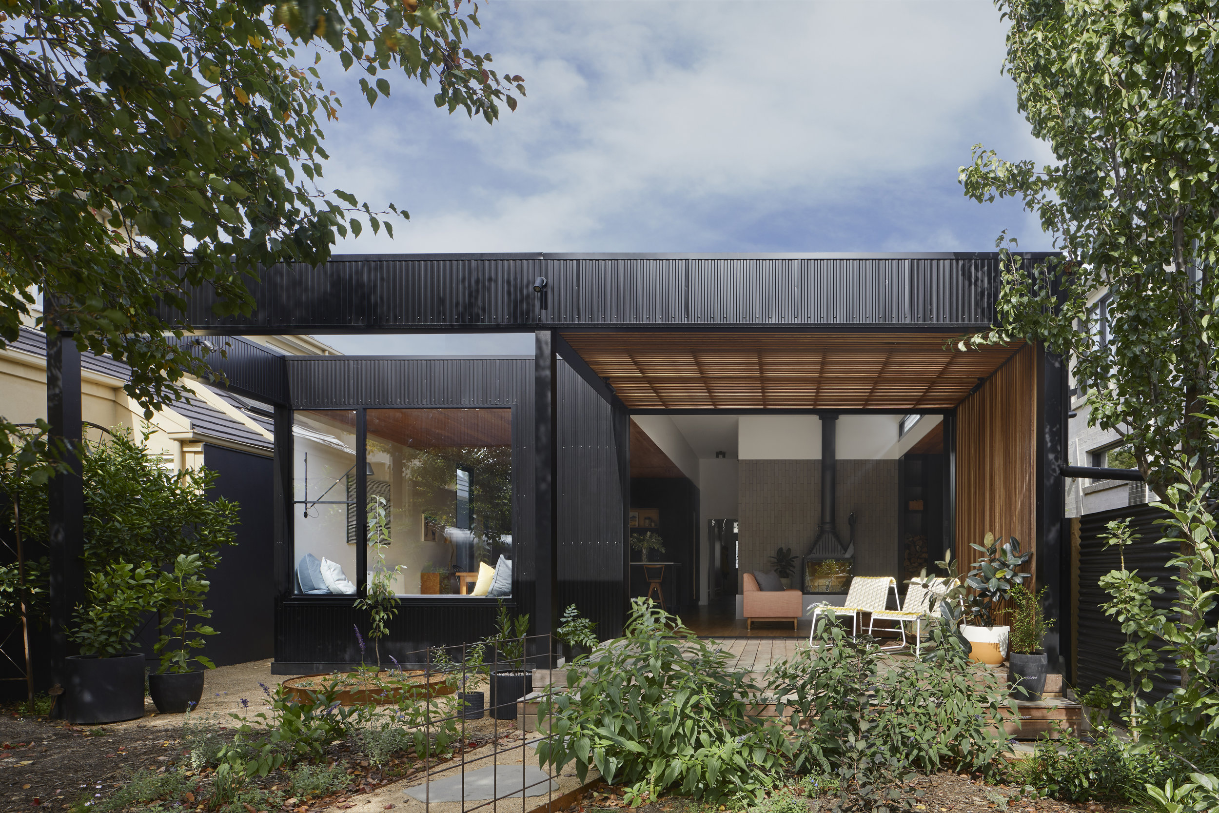
Connecting and blurring the boundaries between old and new, inside and outside was essential for this modern family home. A concept developed around the creation of frames: framing spaces and framing views, internally and externally. Simple black forms frame the much-loved old pear tree and an opening to the sky above. The window seat and timber battened deck are treated likewise, as the viewer looks from the outside in, and from the inside out. These framed transitional spaces invite the inhabitants to rest between domains, enjoying the best of both worlds.
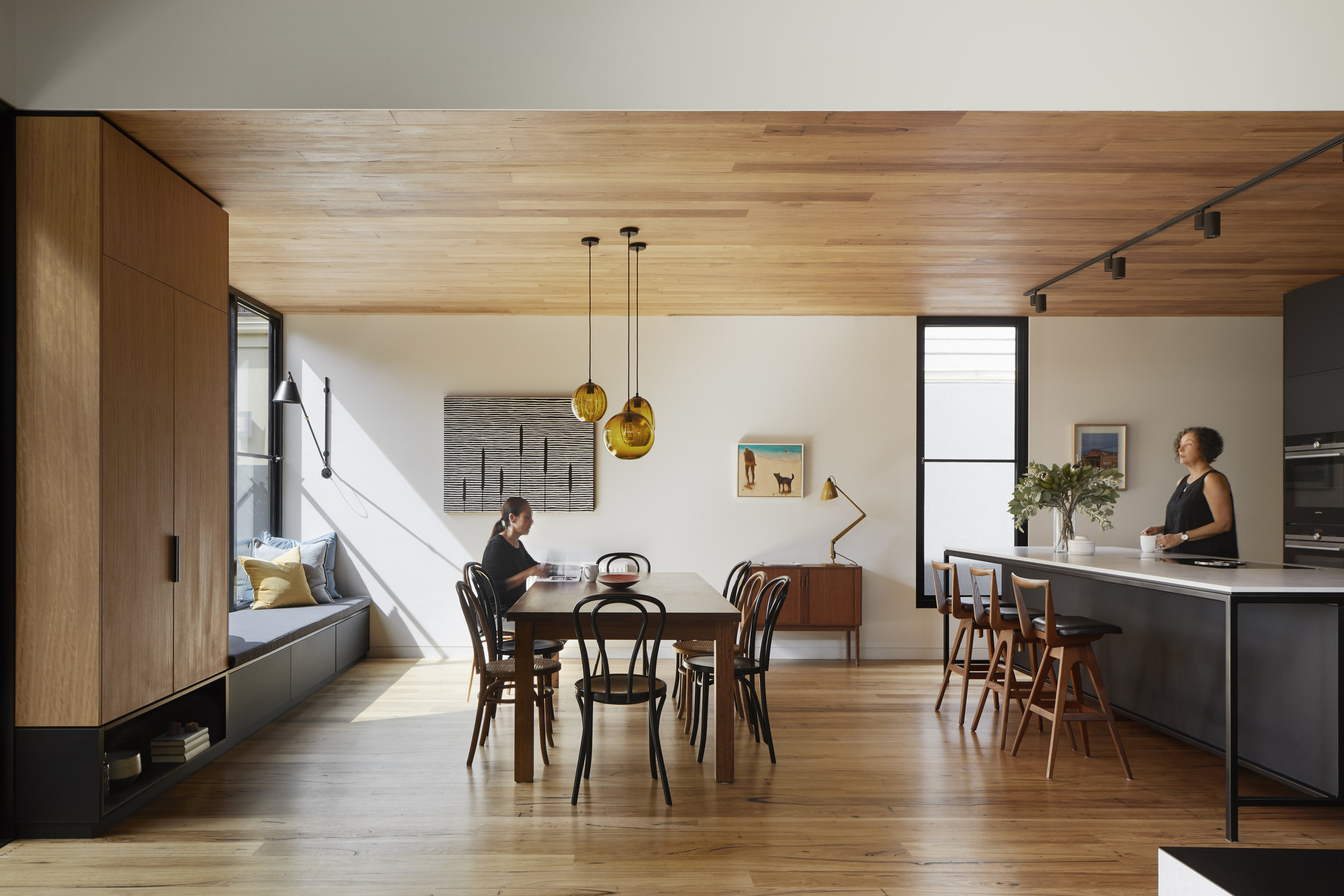
Internally new living additions were added but given lowered timber ceilings, creating warmth, but also helping to manipulate the volumes to identify different areas and create spatial variety: kitchen, dining, day beds and window seats. The lowered rooflines also provided an opportunity to bring in high-level shafts of natural light. The light from the large expanses of glass changes and transforms the spaces throughout the various times of day and ensures leafy views from every room.
THE MATERIALS
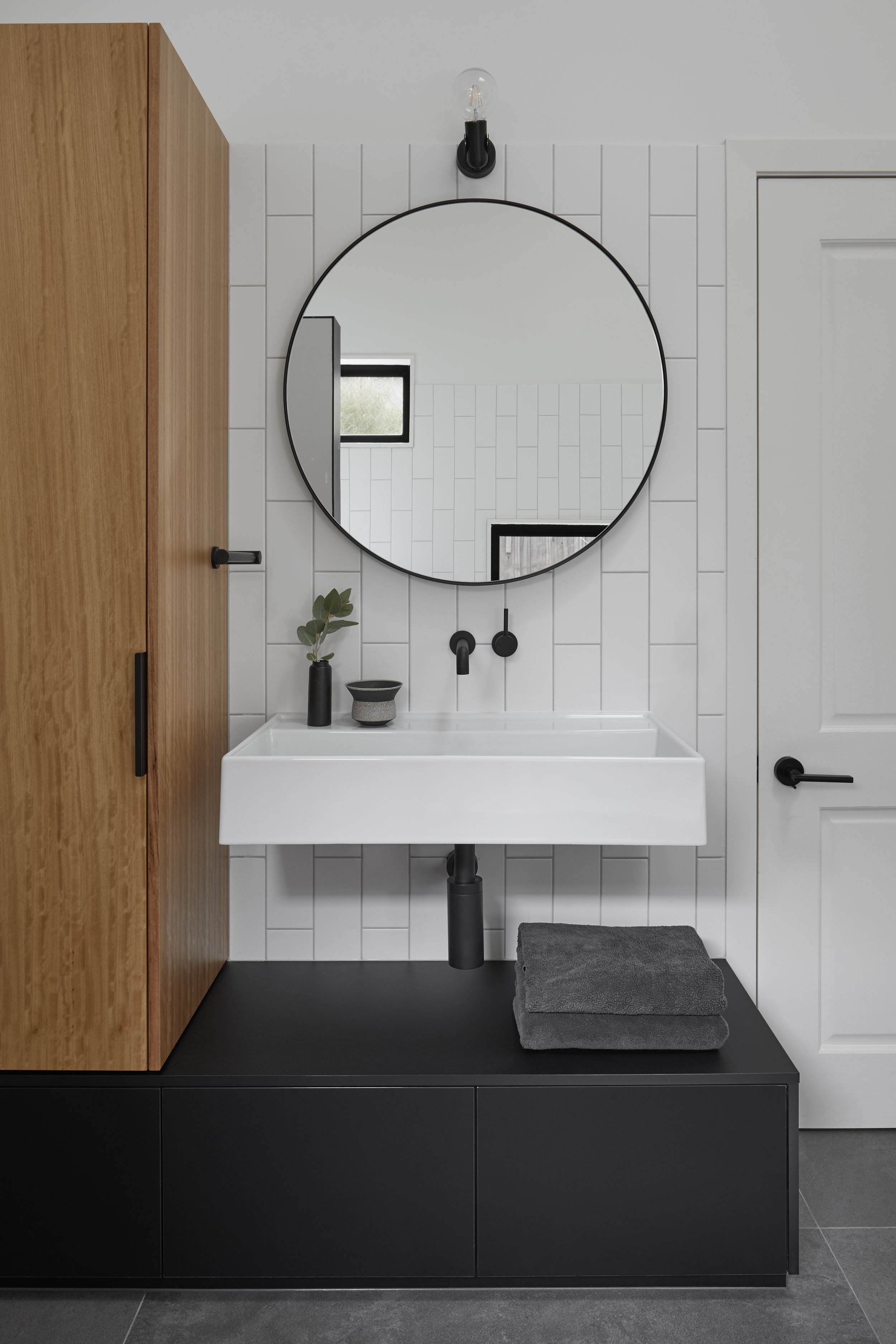
The material pallet was kept quite minimal and raw: Australian hardwood timbers and veneers, white plasterboard, matt black cabinetry, vertical subway tiles, soft grey stone bench tops and plinths, custom black steel detailing, and expanses of glass. As with the interior selections, the exterior extension needed to be minimalistic and very robust – black colourbond low profile steel cladding was a perfect choice. The deck, encased in timber battens, blurs the transition between outside and inside. A restrained pallet of materials and simple forms creates an enduring and contemporary addition to this heritage house.
THE OUTCOMES
The charming Victorian façade reveals little of the contemporary architectural statement at the rear of the home. The rear extension gives a distinct nod to mid-century design, with its flat rooflines, open plan spaces, ample glass, uninterrupted indoor / outdoor areas and custom built-in furniture. This approach compliments Mick & Felicity’s collection of mid century furniture and art pieces.
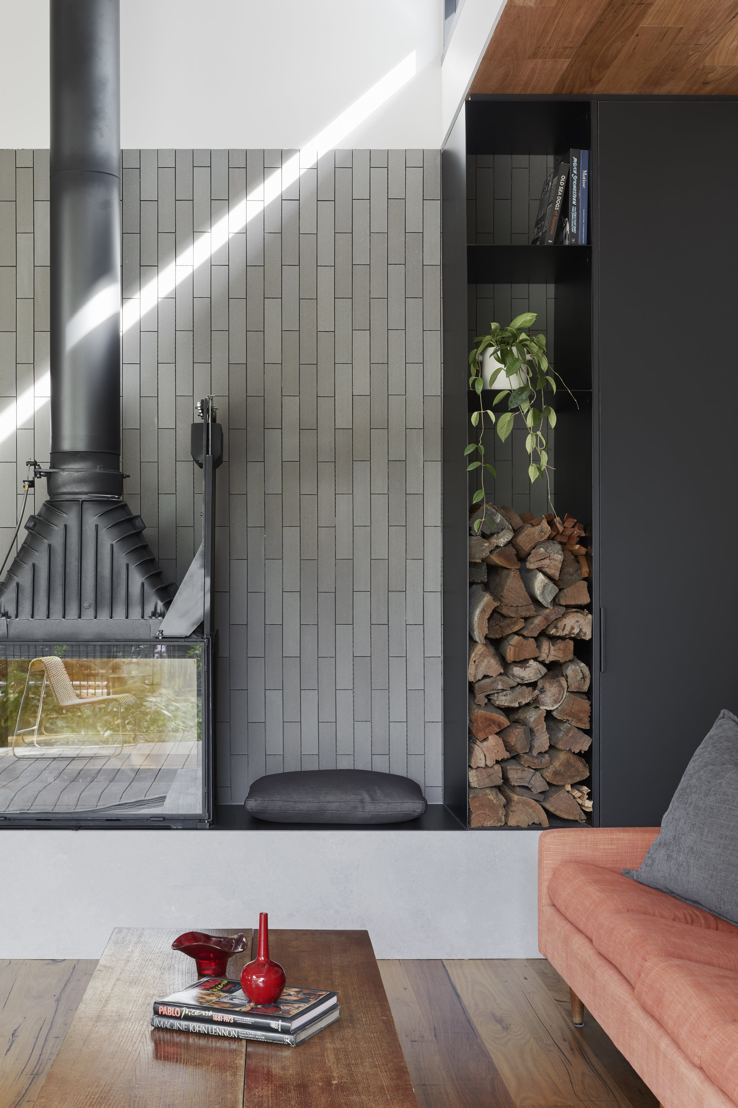
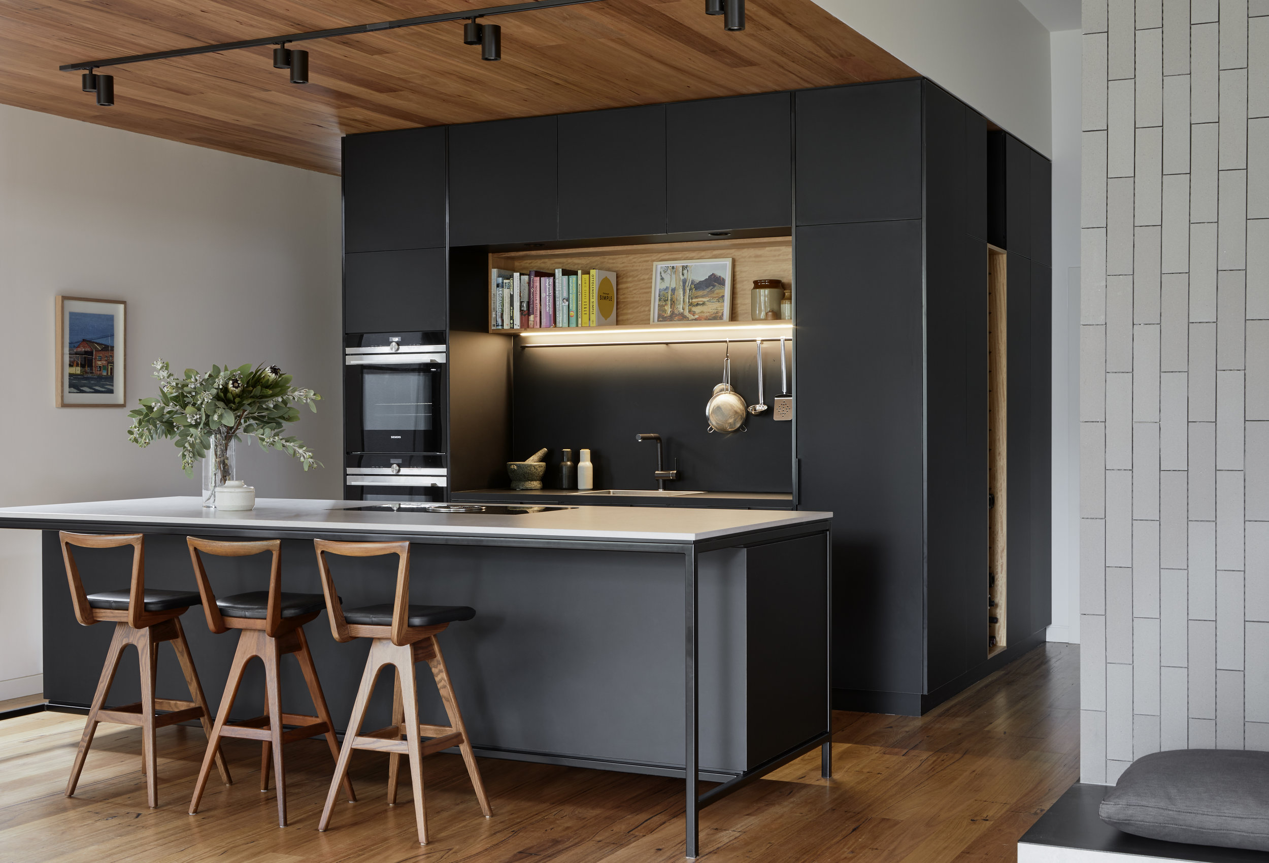
The client had requested two specific wishes be incorporated into the design: a Cheminees Philippe fireplace and a black kitchen.
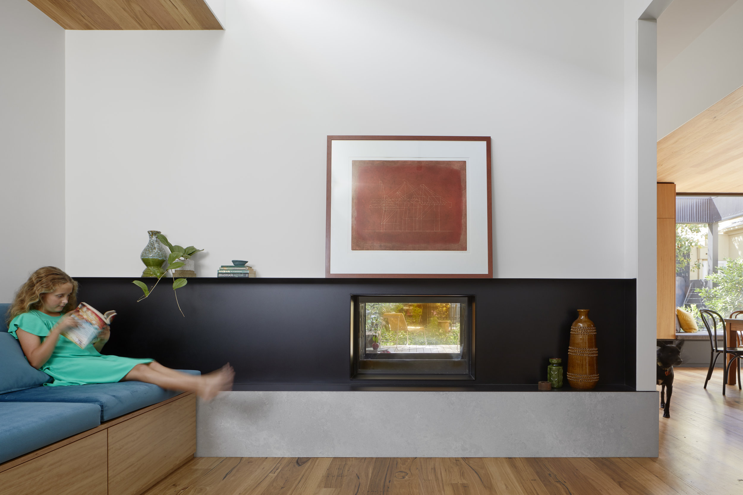
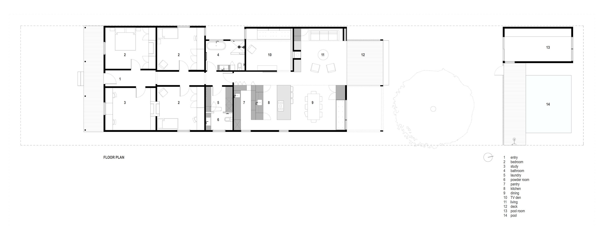
As the main living room and TV den were located beside each other we devised the idea of using a double fronted fireplace that would service both spaces. A custom steel shroud was designed so a dividing wall could be placed between the two rooms for physical and acoustic separation. The stone plinth grounds the fireplace and unifies the spaces, while the bespoke black steelwork give each room a separate identity. The result is a shared heat source and visual connection (you can see right through to the backyard pool from the tv den), while maintaining two individual spaces, finishes and atmospheres.
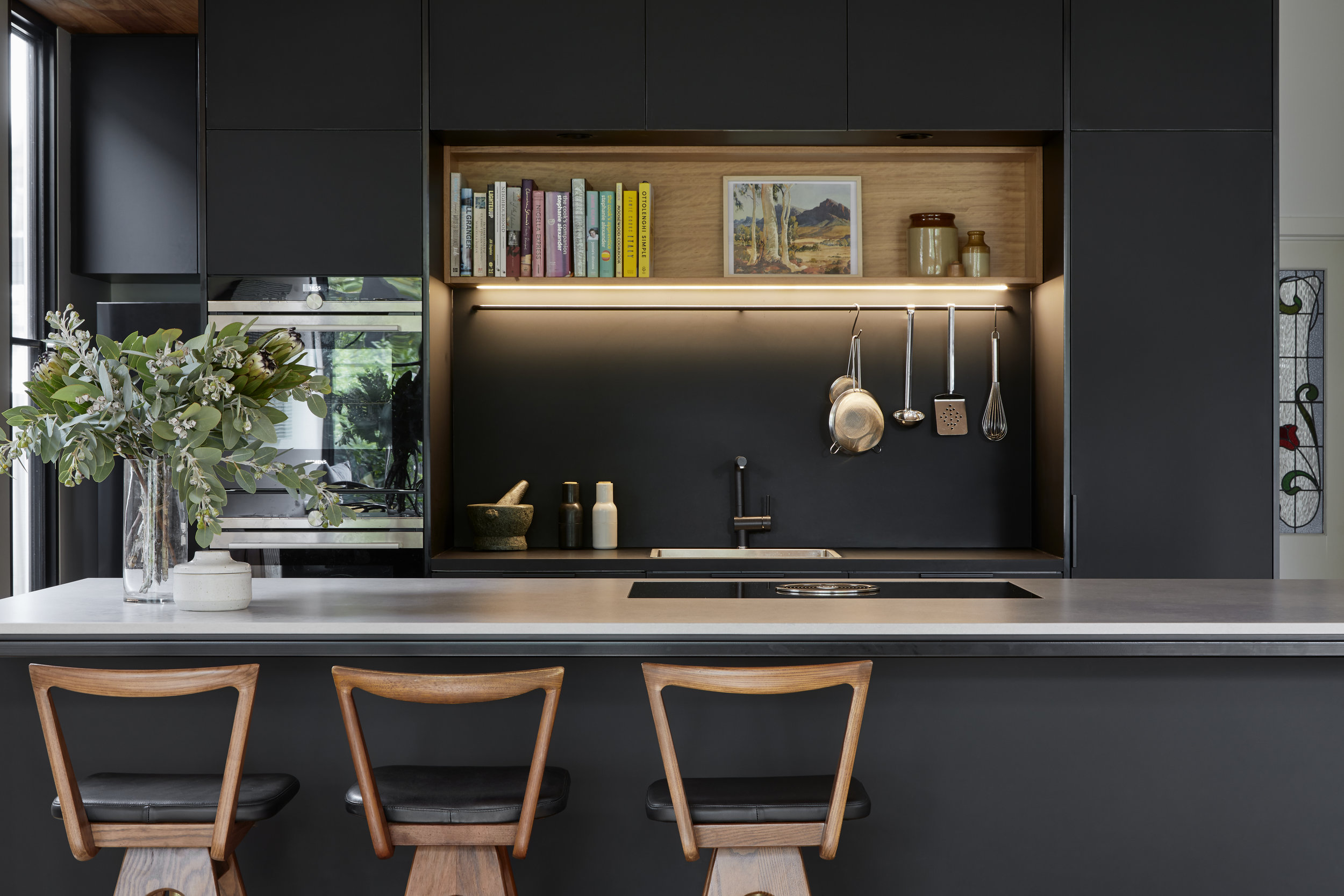
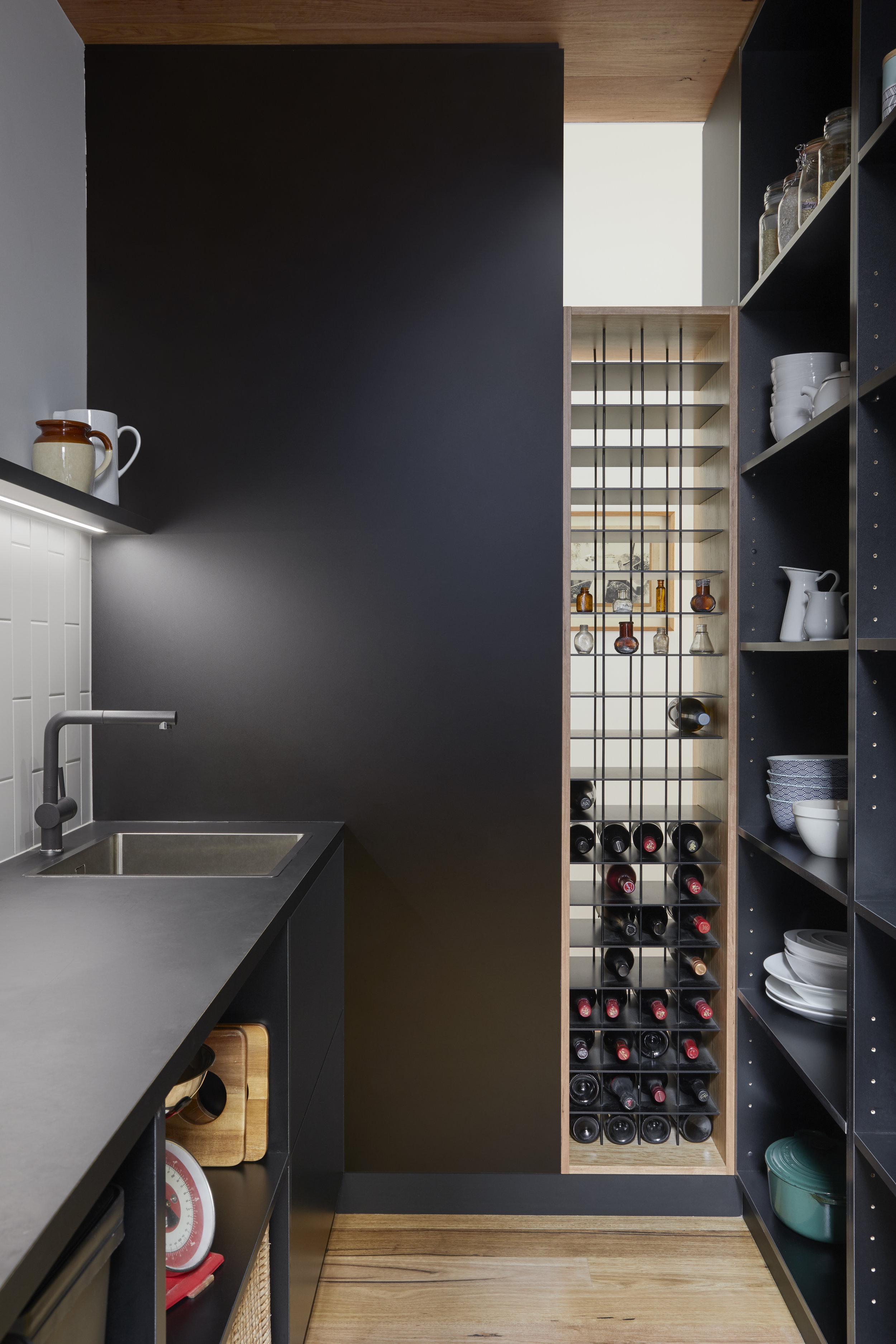
The black kitchen with its concealed butler pantry and 2way wine rack was conceived as an object / pod inserted under the lowered timber ceiling. Connected to the living spaces but an element in it’s own right – the kitchen is the heart of the house. Felicity loves to cook and enjoys the girls getting involved around the island bench. The Cooktop is front and centre and with a view to their garden.
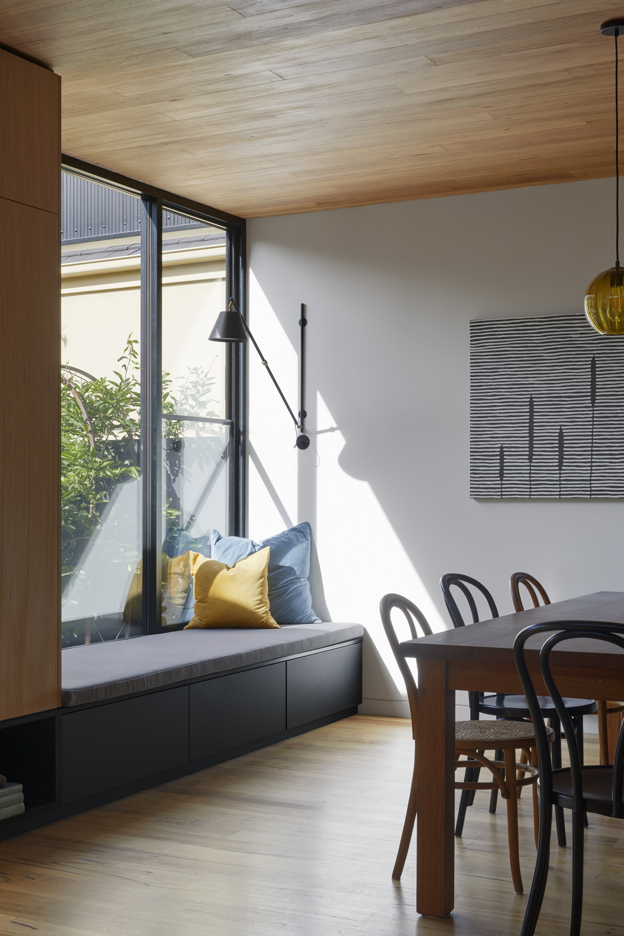
Mick & Felicity love to share stories of the multiple uses for the window seat in their dining room: a quiet reading nook, a spill out space at parties, a platform to catch the morning sun, a stage for their daughters performances, a debriefing station at the end of the day, and if that's not enough it's a handy storage space!
The built outcomes aside, we are most proud of the connections this house has created: between family members, between client and architect, and between dog and architect too! It was a pleasure working on this project with this family.
SUSTAINABILITY
The front heritage section of the house required extensive renovations which provided the opportunity to install high-level insulation in the walls, ceiling and under the floorboards to bring the house up to meet modern energy efficiency standards.
The new addition is North facing with large expanses of glass for maximum solar gain. The floor layout has an abundance of window openings that enable good ventilation and cross flow. The house has a hydronic panel heating system supplemented with a wood fireplace for those really chilly days. As with the upgrades to the original house the new additions have high-level insulation added to walls, ceiling and under the floorboards and double gazing throughout.
The house uses LED lighting and has had a new 4.16kW solar system and heat pump installed. The site has an 8000ltr rainwater harvesting system that is used to irrigate the garden and is connected for toilet flushing.
The material pallet was kept minimalistic and very robust with extensive use of sustainably sourced Australian hardwood timbers and veneers.


